There are several tennis courts in Los Angeles’ parks that are open to the public to book for a nominal hourly fee. While there is an existing umbrella government website and app, this dedicated LA Parks Tennis mobile app is a streamlined product designated solely to booking public courts.
My Role
Visual Designer, Interaction Designer, Researcher
Responsibilities
Wearing all the hats on this project, I conducted research and interviews, iterated on low- and high-fidelity wireframes and prototypes, as well as interaction concepts, which on the whole, made for a seamless user experience.
Project Duration
February—April 2023
The Problem
Reserving a tennis court should be a simple process that takes only a matter of minutes. The current means of reserving a court on the city’s website and app is a confusing process rife with pain points that frustrate users and cause them to drop-off.
The Goal
To create a dedicated mobile app that is intuitive, smooth, simple, and fast, that will provide enjoyable experiences for the tennis public and generate more revenue for the city.
Understanding the Users
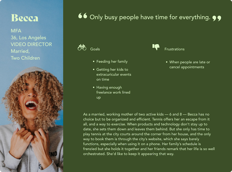
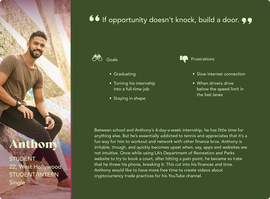
To understand the users I was to design for I surveyed local public pay tennis courts in LA. I found primary users to be active and health-conscious 20-45 year-olds who preferred to book courts using their phones.
Ideation
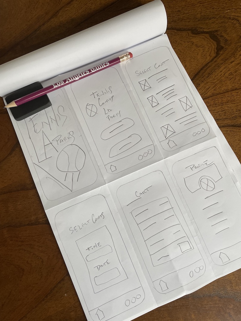
I created p&p wireframes to kick off design ideation process. Using a less is more approach, especially regarding text, I was set on using large font and buttons in place of exposition, and implementing text only where it was imperative.
Lo-fi Ideation
I created p&p wireframes to kick off design ideation process. Using a less is more approach, especially regarding text, I was set on using large font and buttons in place of exposition, and implementing text only where it was imperative.
Preliminary Wireframes
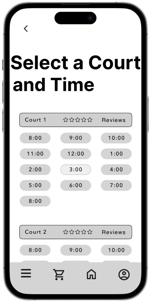
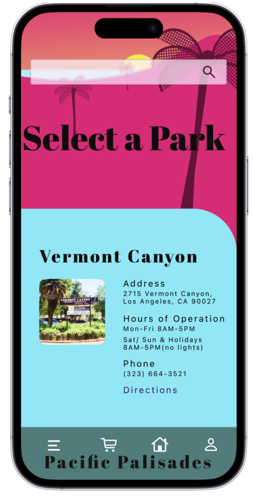
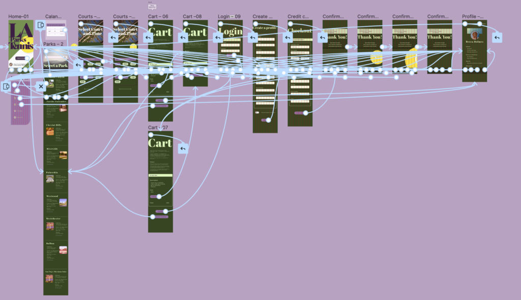
Beyond large font, buttons that created a clear direction, and little exposition, I also wanted to keep scrolling to a minimum, to keep users engaged and onward with their journey. I opted for separate screens for things like Time and Location as well as the exact Court at each location. Many of the paper wireframes held over into digital wireframes, so that digitizing them chiefly meant refining them, which gave me confidence that the structure of the underlying UX was sound.
Refining the Design
Before
After
After
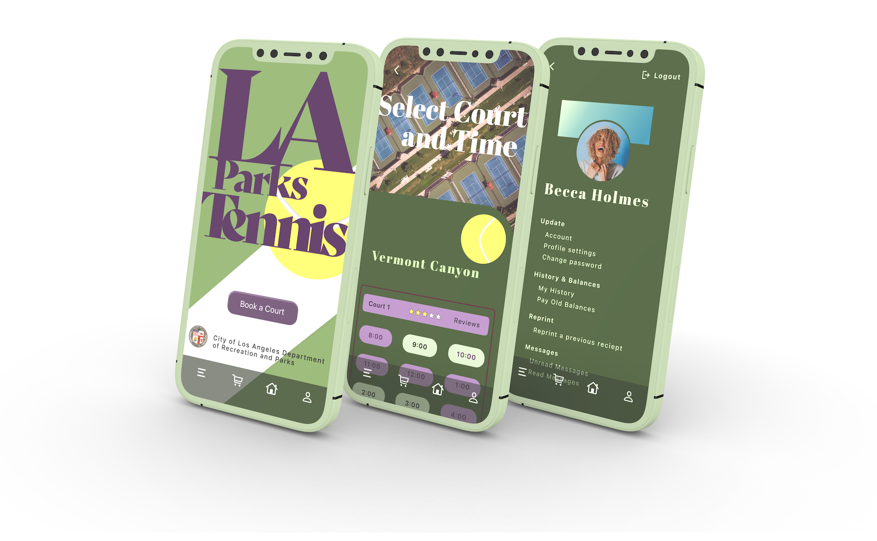
High-fidelity Prototype
Because the existing city website and umbrella app are littered with pain points and are navigationally Bynzantine, I wanted the LA Parks Tennis app to be a breeze to use. An app that users wouldn’t need to spend more than a few minutes on, as the linear wireflow evinces.
Design System
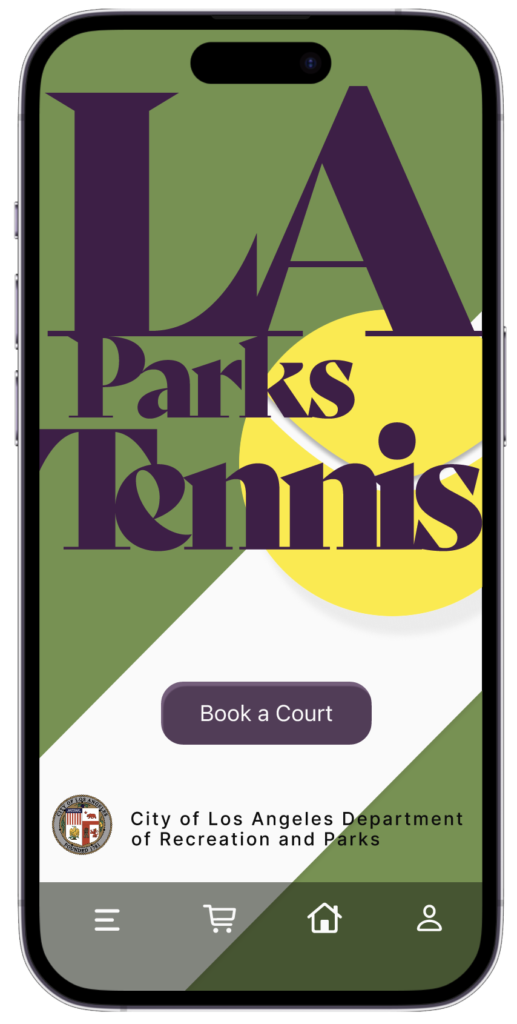
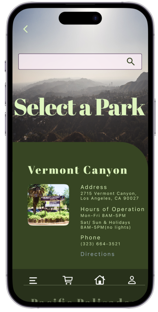
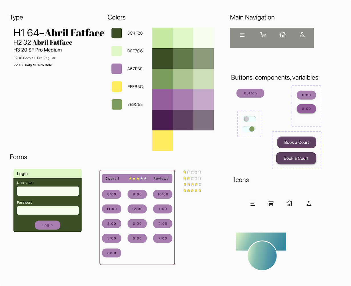
Taking accessibility into consideration can present challenges in creating aesthetic designs. I met the challenge by adjusting the saturation and brightness of the primary, secondary, and accent colors, for additional options, then assessing the accessibility on W3C. This ultimately led to altering the color theme so that the design was both accessible and aesthetically pleasing.
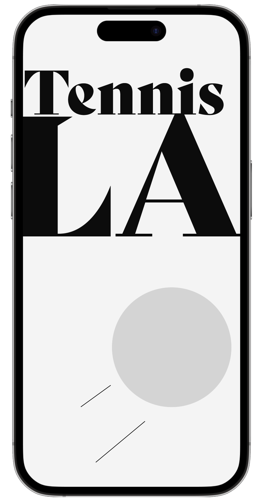
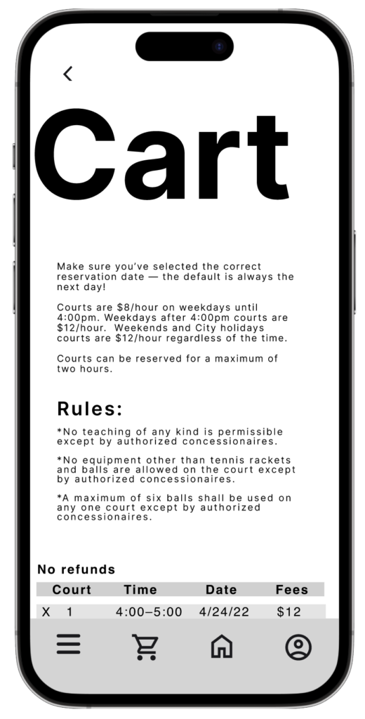
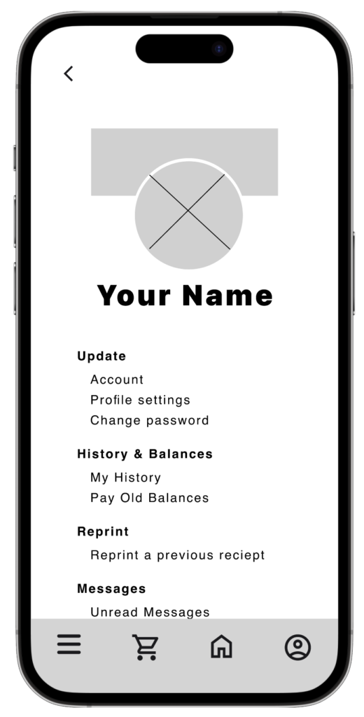
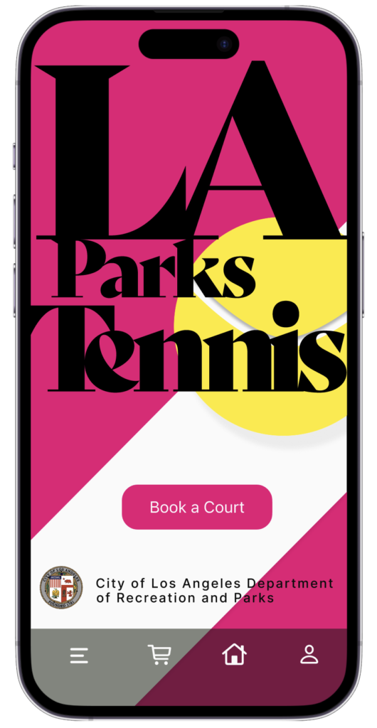
I knew from the beginning that I wanted to use incredibly bold font for the heading, so large that it edged off the screen. That held over. I used Bely Display for the logo, which is captivating and jumps out at the user. And I used the similar typeface, Abril Fatface, for H2, as far as legibility and screen dimension would permit. Body texts are variations of sans-serif typeface SF Pro, which is smart, friendly, and accessible.
Creating a prototype for a sport that centers around a bouncing ball, it’s tempting to create a micro animation for each page. But I used restraint, and aside from subdued dazzle on one of the screens along the journey, I kept micro animations to the splash page and checkout page. Overall the prototype was enjoyable to create. Most of the questions and ideation regarded flow and color choices, which I wish were a few fewer, but I’m pleased with the result. Feel free to try out the prototype.
Takeaways
While I mentioned in passing above that I live in LA, and I play tennis, the means to booking a public tennis court is, among tennis players, notoriously cumbersome. I saw an opportunity to fix something that was broken, and I was happy to hear from participants who tested the LA Parks Tennis prototype that they see a difference that’s night and day.
Implementing some playful interactions and micro animations was fun, and provided me with the opportunity to learn yet more Figma tricks to add to my repertoire—which is always a little confusing and then, once completed, rewarding.
I’m also proud of the color theme I happened upon, and I anticipate it or something similar will imbue forthcoming projects that I have carte blanche on. All in all I’m pleased with the app, feedback on it, and I’m confident it will provide future users a pleasant experience. Hopefully resulting in more people stepping out on the courts more often, getting and staying healthy.
Let’s Connect.
If you’re looking for a UX designer who’s passionate about their designs, please reach out!