Product:Bream is a fictitious seafood and plant-based restaurant in the Los Feliz neighborhood of Los Angeles. It has many regular customers who work in its adjacent hospitals. Its app and website provide users the opportunity to order directly from Bream rather than a third-party food delivery company, and provides the restaurant the ability to implement daily changes to its menu.
My role: UX designer, UX researcher, and UX writer.
Responsibilities:Conducted interviews, created paper and digital wireframes, low- and high-fidelity prototypes, wrote copy, conducted usability studies, and iterated on designs.
Project duration: 8/10/2022—11/10/2022
The problem:Busy working adults lack time to cook for themselves.
The Goal: To create an intuitive and accessible app and website that customers can use to order directly through Bream.
Understanding the User
Understanding the User
User research
Personas
Problem statements
User journey maps
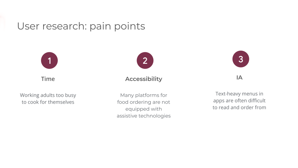
To understand the needs of the users I was to design for, I conducted interviews and created empathy maps. Through research I found that the primary user group identified was 25–50-year-old working adults who have limited time to cook meals.
This user group confirmed initial assumptions, but research also revealed that time was not the only factor. Other problems included obligations, interests, or challenges that make it difficult to procure groceries to cook, or dine in at restaurants.
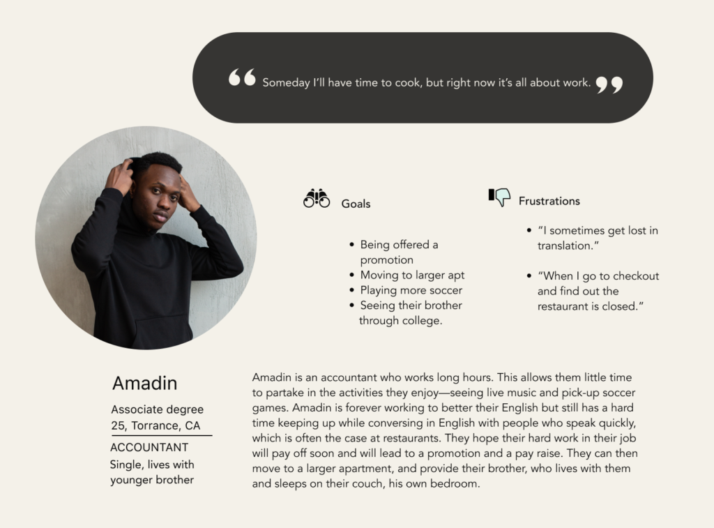
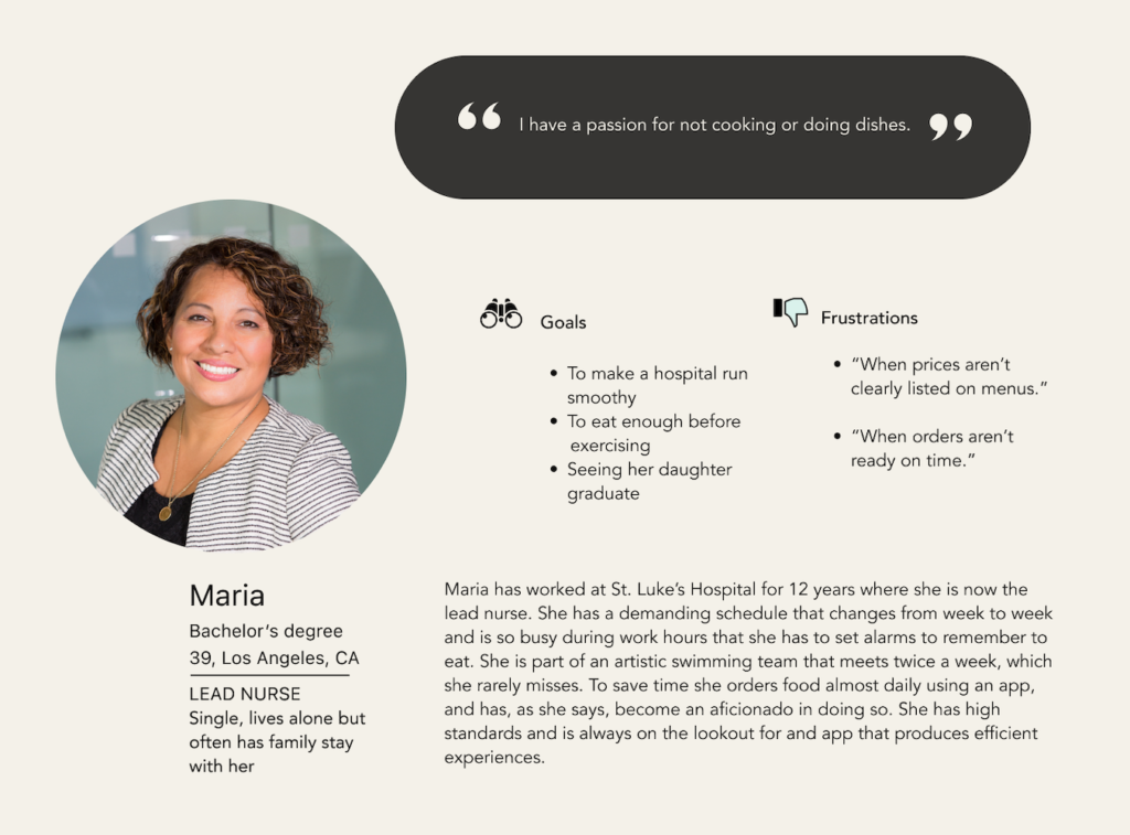
Meet the Users
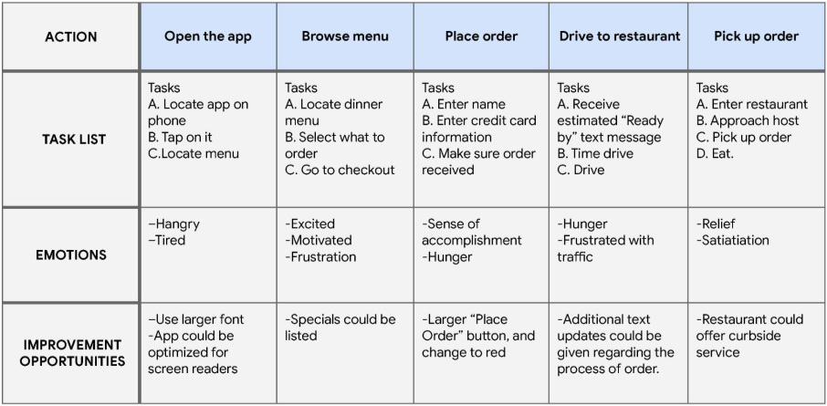
Maria’s User Journey Map
Maria’s User Journey Map
Goal: To order food to eat after work, before her swim meet.
Starting the Design
Starting the Design
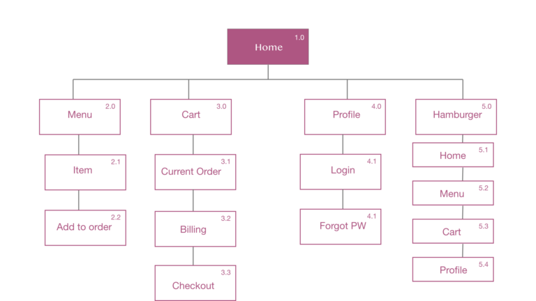
Prior to creating wireframes I created a sitemap for the app and website to show clearly the information architecture.
Prior to creating wireframes I created a sitemap for the app and website to show clearly the information architecture.
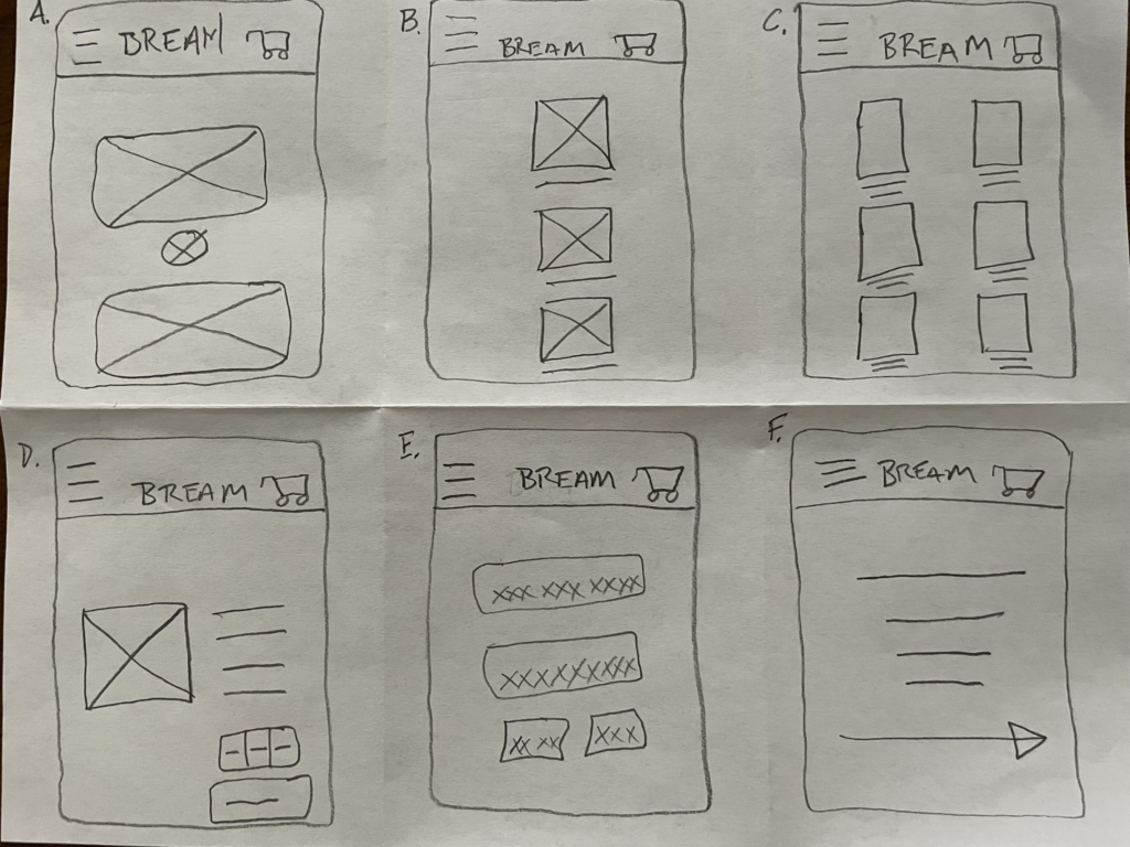
Thesesimple wireframes are the first incarnation of many iterations.
Sketching paper wireframes: One of the fasted, most effective, and cost efficient ways to start generating design ideas. These simple wireframes are the first incarnation of many iterations.
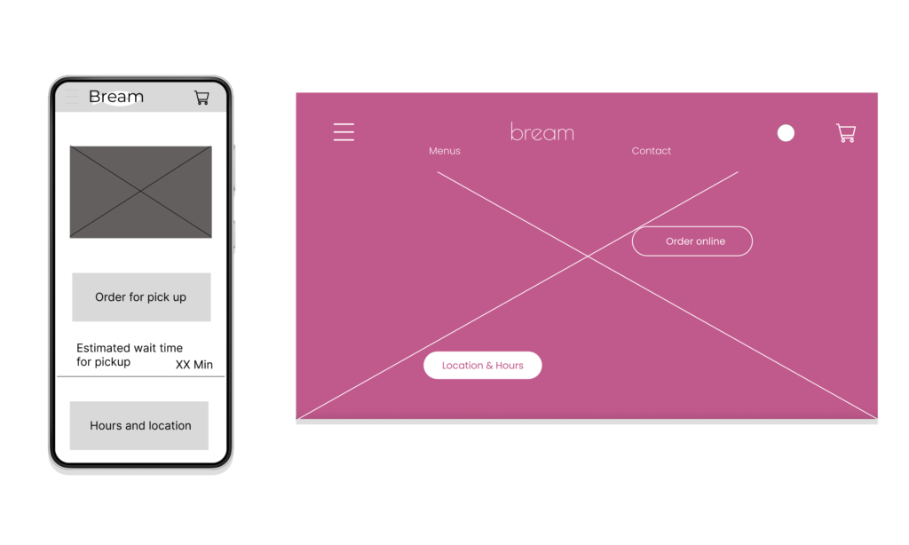
After deciding on the general layouts, I created digital wireframes—in Figma for the app and Adobe XD for the website.
After deciding on the general layouts, I created digital wireframes—in Figma for the app and Adobe XD for the website.
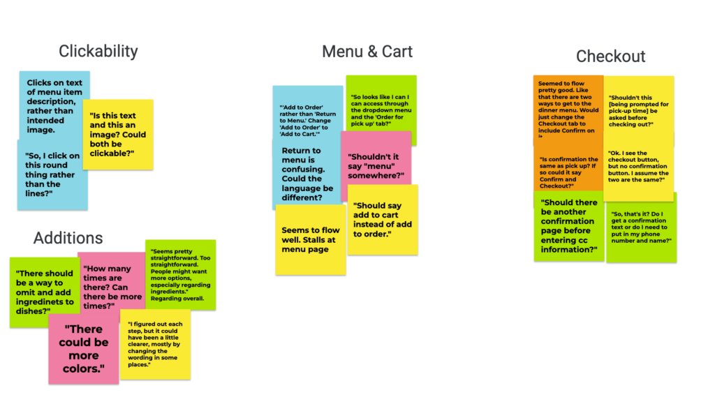
An unmoderated, remote, usability study was done with five participants. The goal: Identify any user difficulties and pain points. A few of the usability research questions were: Where does the user get stuck? How long does it take for the user to check out? What can we learn from the user flow and how might the product be improved?
Using KPIs such as Time on Task, Navigation verses Search, and Conversation Rates, I analyzed what changes needed to be made.
Participants answered a series of general questions and completed tasks. Afterward they completed a System Usability Scale.
Upon gathering data, I began to synthesize it, in part by making an affinity diagram→
Some Findings
1. Users wanted more customized options. 2. Users wanted to tap on text as well as images. 3. User were confused by phrase “Add to order.” 4. The global color of buttons was too light. 5.More pick-up times needed to be offered.
Refining the Design
Refining the Design
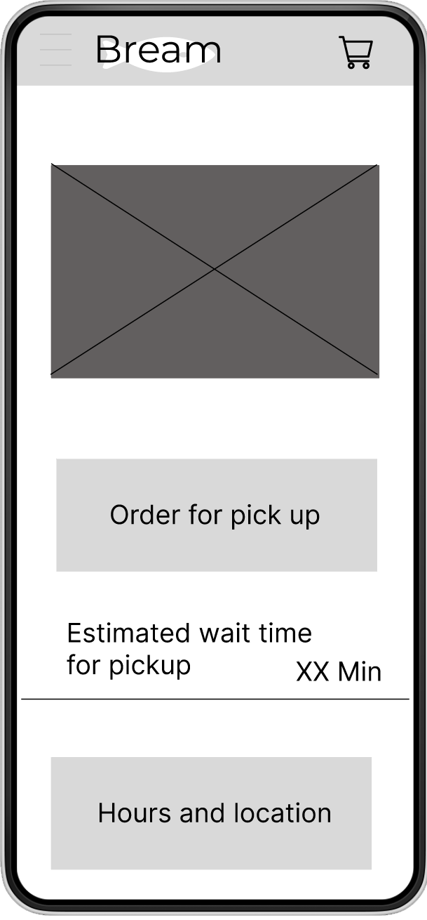
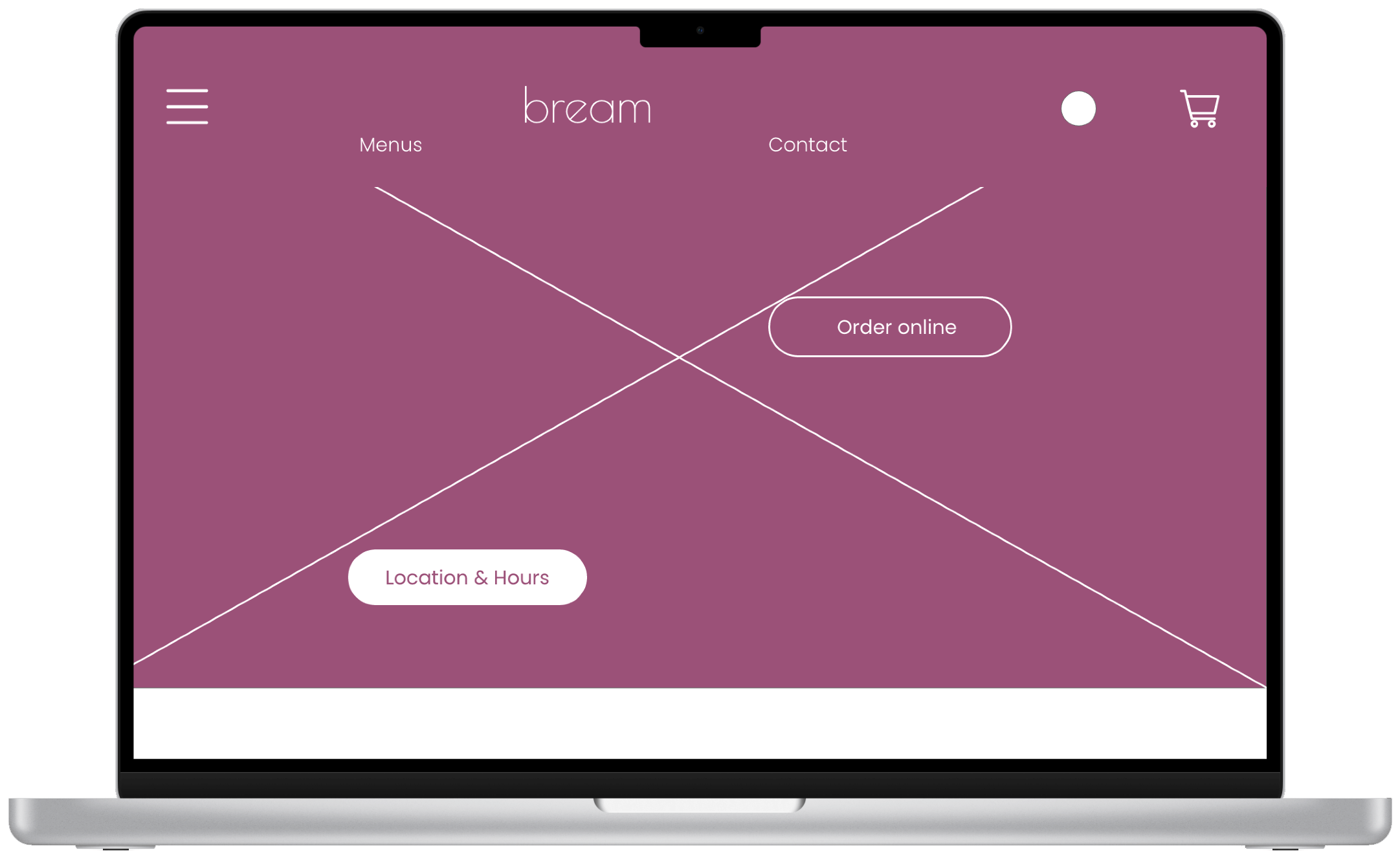
Mockups
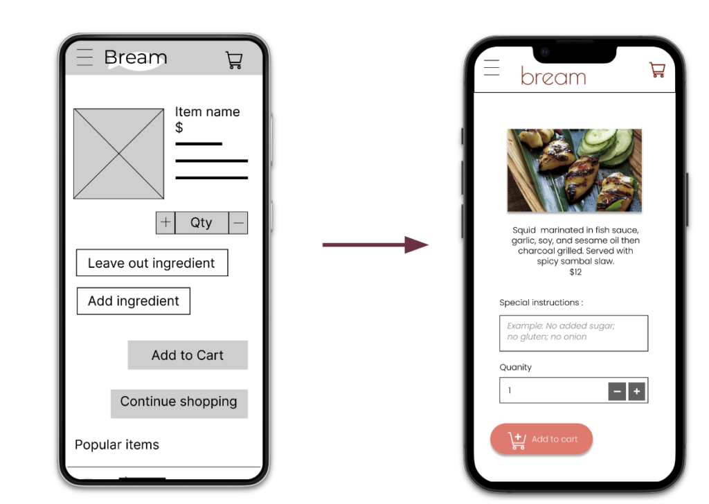
Early designs allowed for some customization, but after the first usability study I opted to leave a box for users to add instructions and omit ingredients giving them more liberty to explain their dietary restrictions.
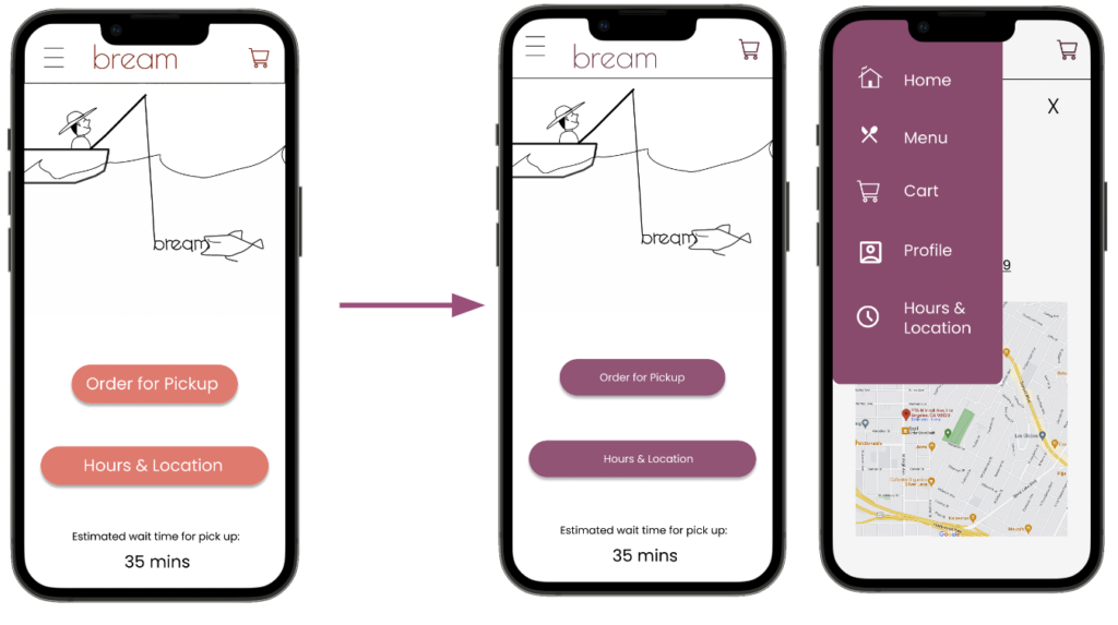
A chief alteration made after the second usability study was implementing a darker color theme that’s more accessible for people with visual impairments.
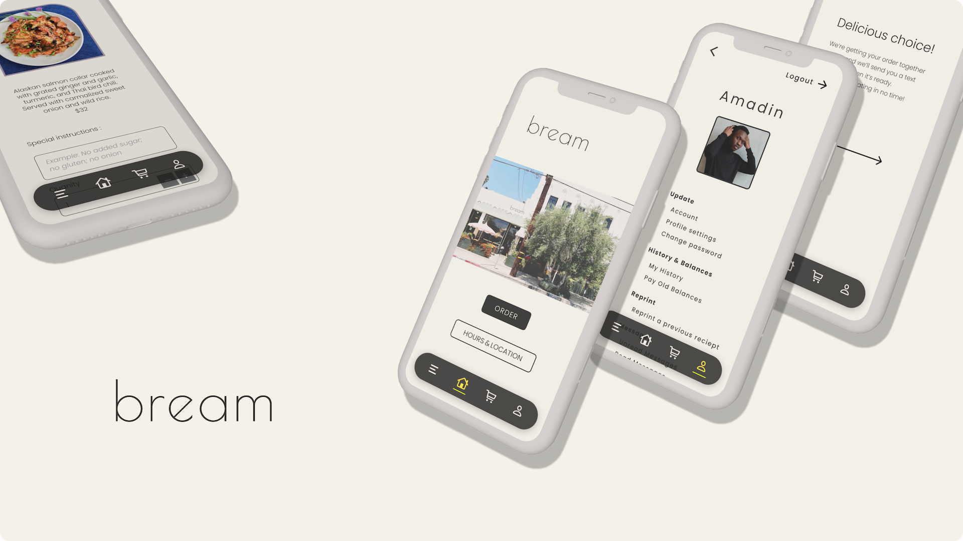
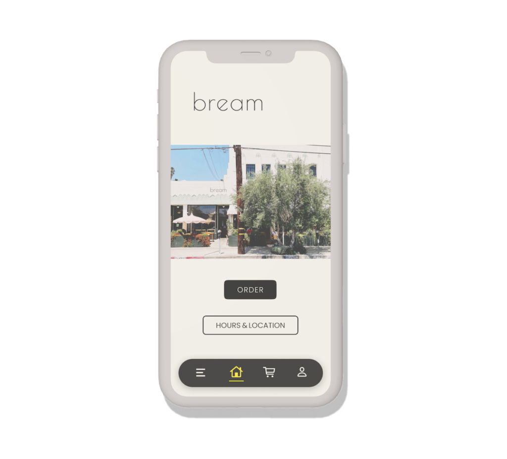
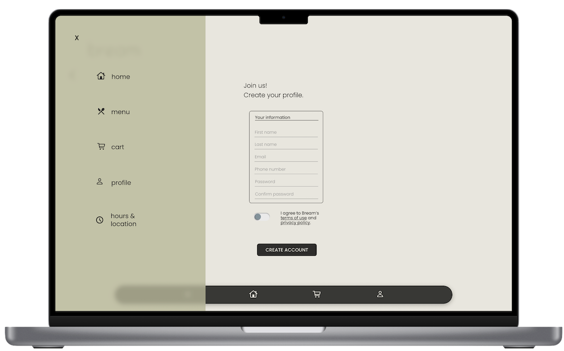
After further testing, and more iterations, a final prototype was created using an equally simplistic and intuitive design, but one that is less playful and more sophisticated—which more accurately matches the restaurant’s identity.
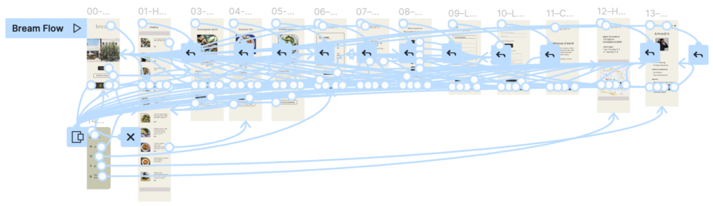
Wireflow
After much testing and many iterations, the wireflow makes for a seamless user flow.
After much testing and many iterations, the wireflow makes for a seamless user flow.
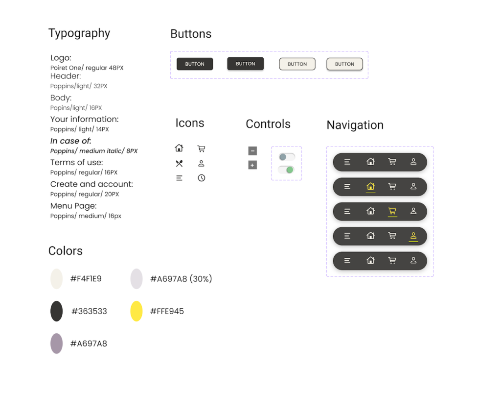
Design System
With accessibility considerations at the fore, to create a simple, inclusive design, I used contrasting light and dark colors, and large buttons, icons, and images. The main typefaceI used is the sans-serif typeface Poppins, whichis clean, sophisticated,and easy to read.
With accessibility considerations at the fore, to create a simple, inclusive design, I used a warm deep color contrasted wtih white, and large buttons, icons, and images. The main typefaceI used is the sans-serif typeface Poppins, whichis clean, sophisticated,and easy to read.
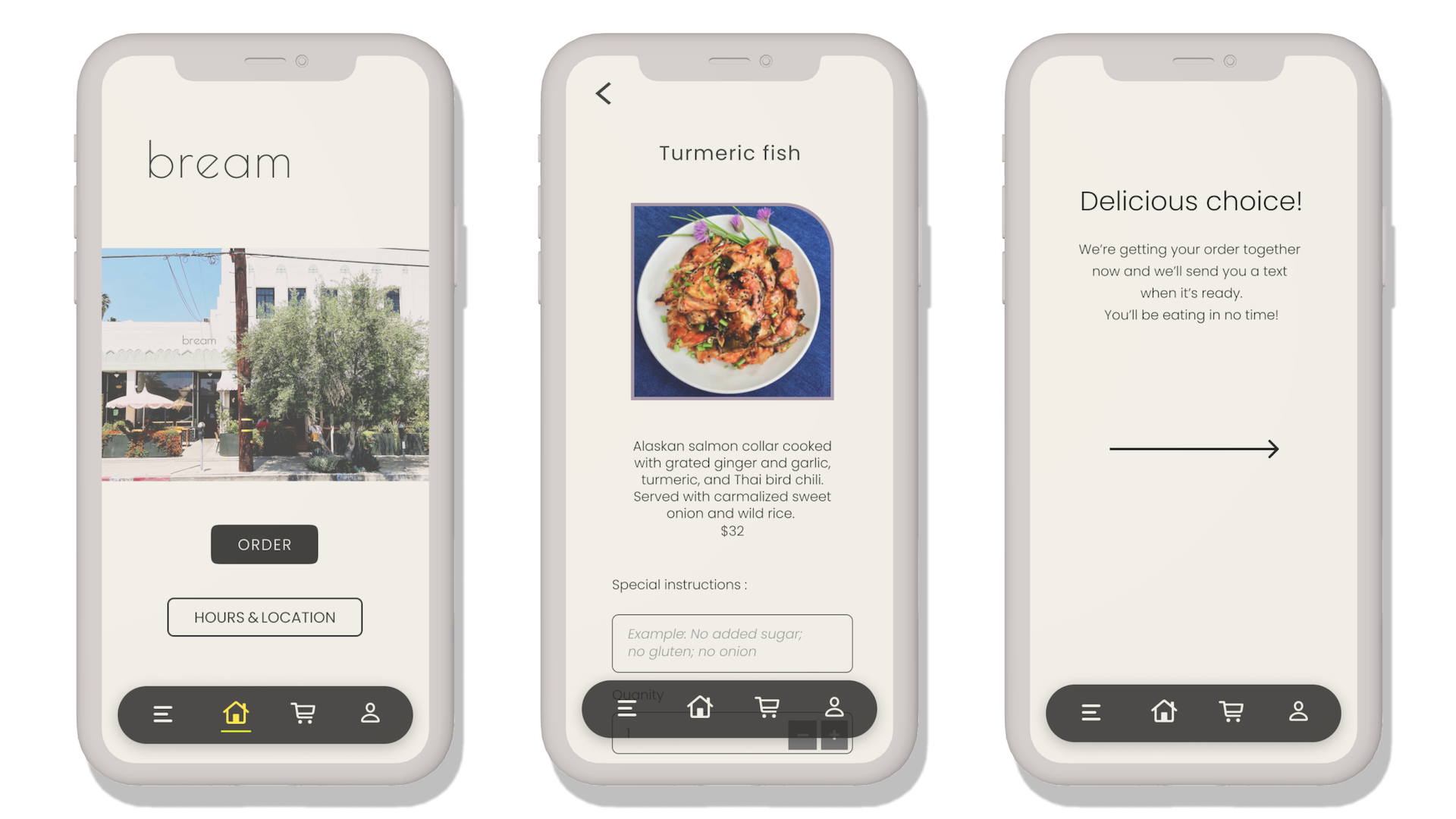
The Final Products
The Final Products
See how everything came together and play around with the the high-fidelity prototypes of theappand the website.
Takeaways
A great deal of work went into this project and I can’t overstate how much knowledge I attained from it, especially designing for accessibility.
I have much experience writing about food and beverages for publications, as well as experience in the restaurant industry (and I love to cook) and I was grateful for the knowledge I gleaned from those pursuits so that the lion’s share of attention on this project could be devoted to design and the overall user experience. I was pleased to learn that users felt that the products were intuitive, the flow fluid, and the overall process efficient.
Let’s Connect.
If you’re looking for a UX designer who’s passionate about their designs, please reach out!