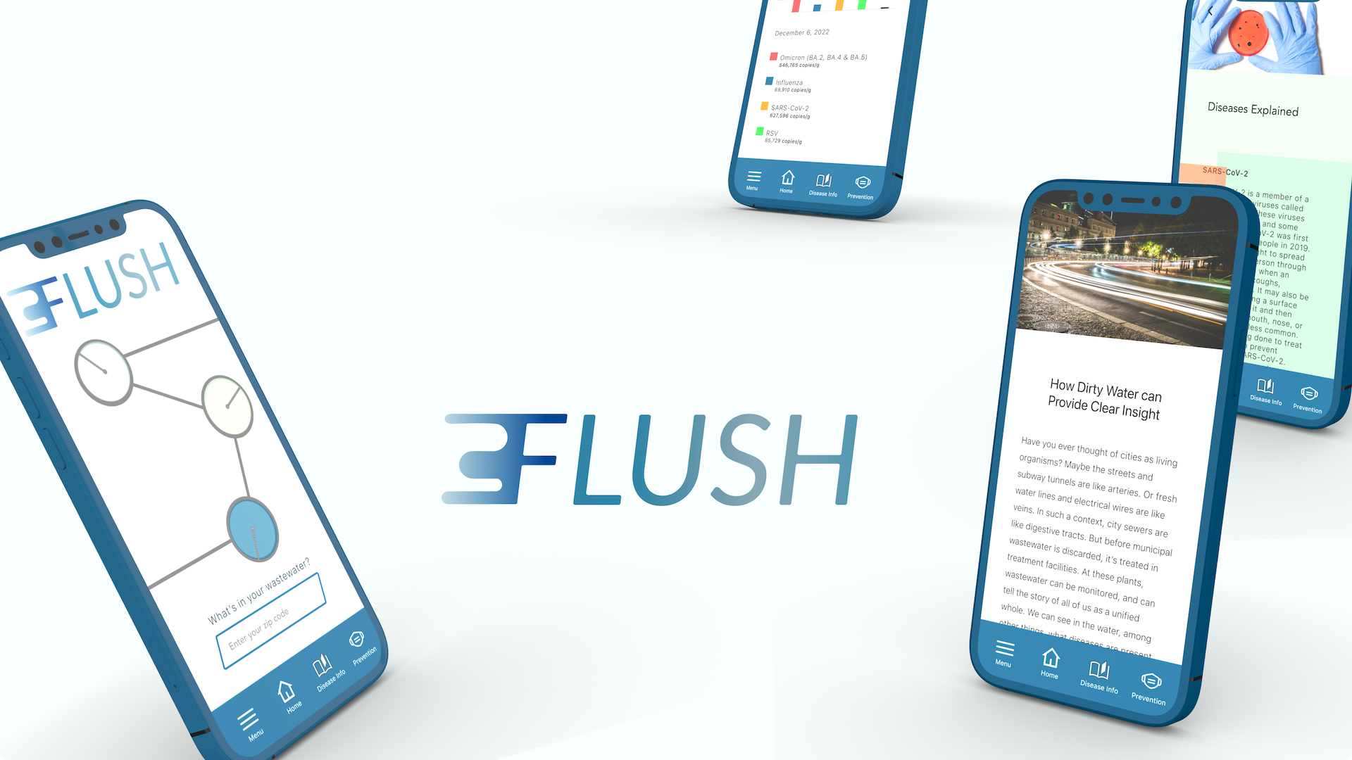
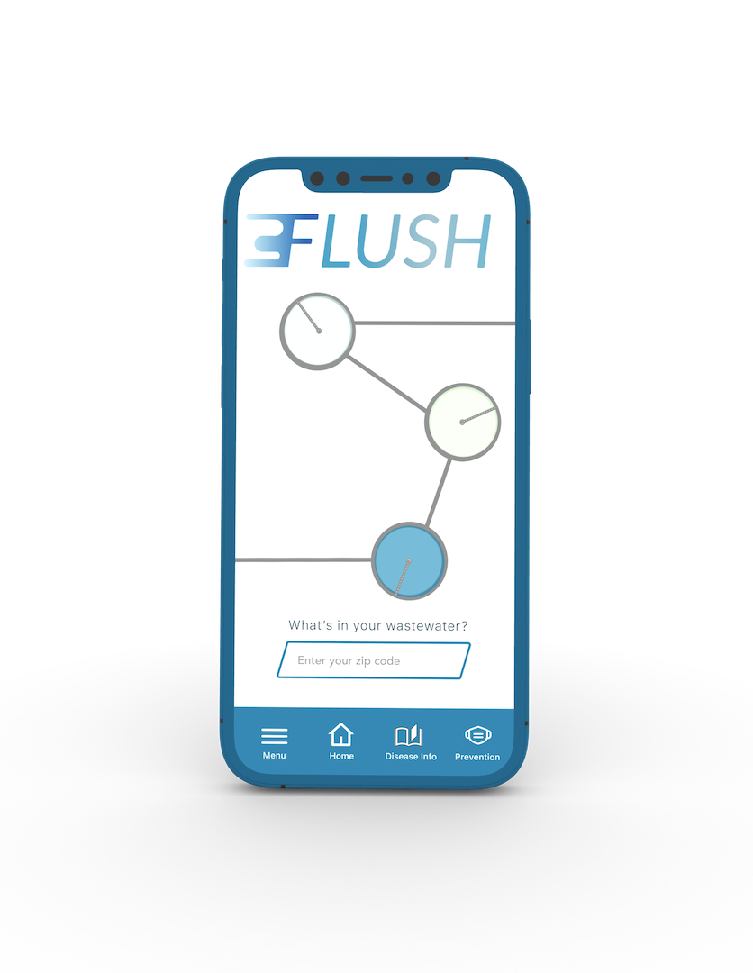
Product Flush is an app and website that provides access to data on diseases found in municipal wastewater. It informs users of the level of certain diseases found in local wastewater, and serves as a bellwether for detecting outbreaks.
My Role UX designer and UX researcher
Responsibilities Conducted competitive audits, interviews, and usability studies. Iterated on designs—created paper and digital wireframes, and low- and high-fidelity prototypes. Project Duration October—December 2022
The Problem Municipal wastewater surveillance is being conduct in more and more locales, but there are few services (and no easily discoverable apps) that directly offer people data on diseases detected in the wastewater in particular areas.
The Goal To provide an app and responsive website that will provide users with local wastewater surveillance data to be viewed much the same as a weather forecasting or air quality product.
Understanding the Users
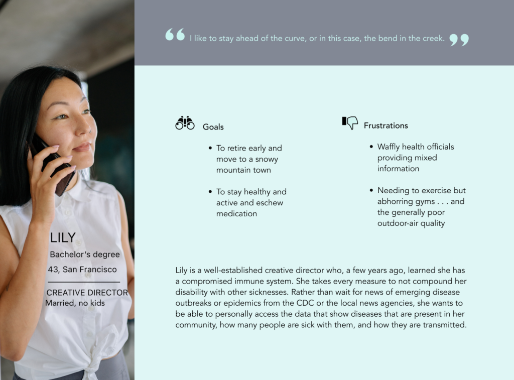
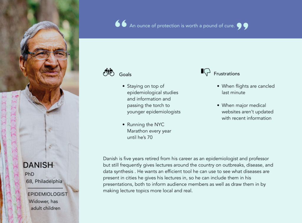
To understand the needs of the users I was to design for, I conducted user research and a competitive audit, created personas and problem statements, and ideated. Through research I identified the primary user group was socially- and health-conscious 35–70-year-olds.
This user group confirmed initial assumptions, but research also revealed that their health and their community’s health were not the only factors of concern. Research showed that users might implement the product as a tool to conduct their own scientific research.
To understand the needs of the users I was to design for, I conducted user research as well as a competitive audit, created personas and problem statements, and ideated. Through research I identified the primary user group was health- and socially–conscious 35–70-year-olds.
Competitive Audit
Competitive Audit
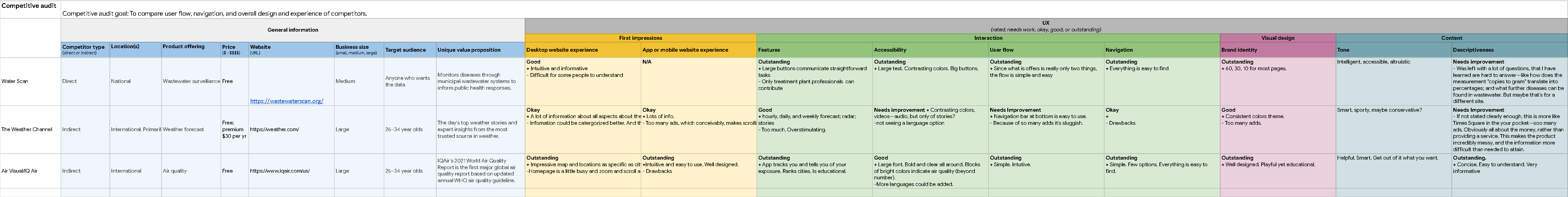
In a competitive audit I looked at two indirect competitors, and one similar/direct competitor to compare user flow, navigation, and overall design and experience. The majority of the features between competitors were similar, but there we some discernible differences, such as:
–Too Many Screens vs Simplified Interaction –Bright/Distracting Interface vs Minimalist Interaction –Confusing Data vs Lucid Information
In a competitive audit I looked at two indirect competitors, and one similar competitor to compare user flow, navigation, and overall design and experience. The majority of the features between competitors was similar, but there we some differences that I noticed:
–Too Many Screens vs Simplified Interaction –Bright/Distracting Interface vs Minimalist Interaction –Confusing Data vs Lucid Information
Ideation
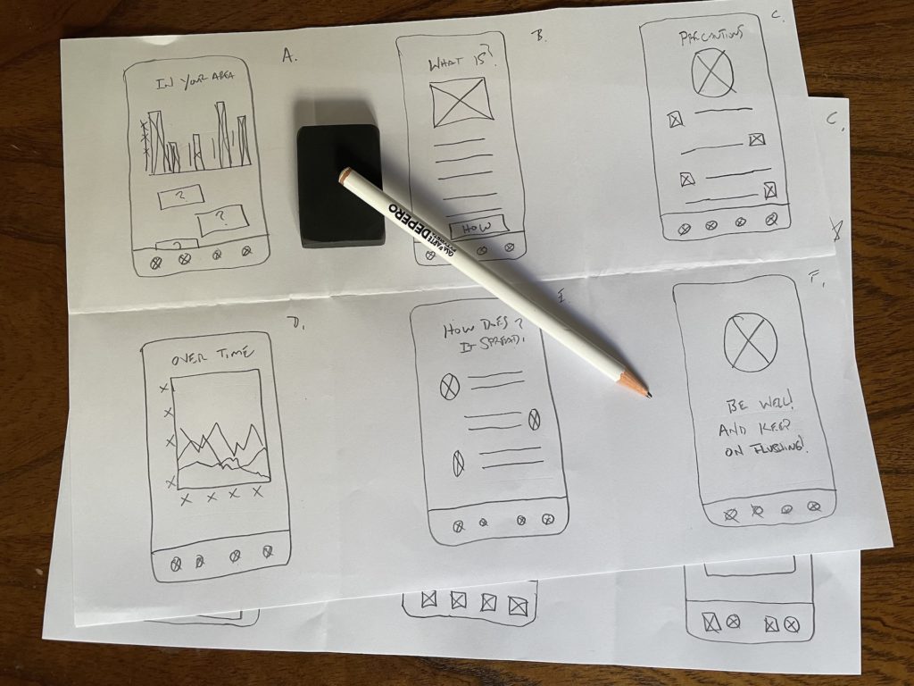
To gain an initial understanding of how the app should look and flow, before jumping into digital wireframing, I began ideating with Crazy 8s and then later with paper wireframes.
Ideation
To gain an initial understanding of how the app should look and flow, before jumping into digital wireframing, I began ideating with Crazy 8s and then later with paper wireframes.
Starting the Design
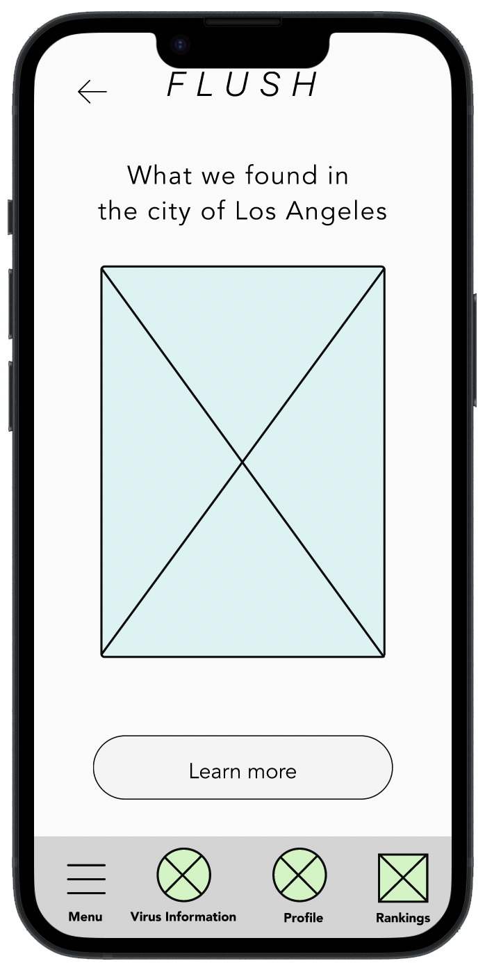
After sketching out some p&p wireframes and listening to feedback, I began to consider what was imperative, and what was superfluous, and I looked at areas that could be improved. Then, in laying out low-fidelity digital wireframes, I made sure that the underlying UX was well structured before moving on to applying visuals.
After sketching out some p&p wireframes and listening to feedback, I began to consider what was imperative, and what was superfluous, and I looked at areas that could be improved. Then, in laying out low-fidelity digital wireframes, I ascertained that the underlying UX was well structured before moving on to applying visuals.
I then linked the screens in a low-fidelity prototype to demonstrate the user flow and prepare for the first round of user testing.
I then linked the screens in a low-fidelity prototype to demonstrate the user flow and prepare for the first round of user testing.
I then linked the screens in a low-fidelity prototype to demonstrate the user flow and prepare for the first round of user testing.
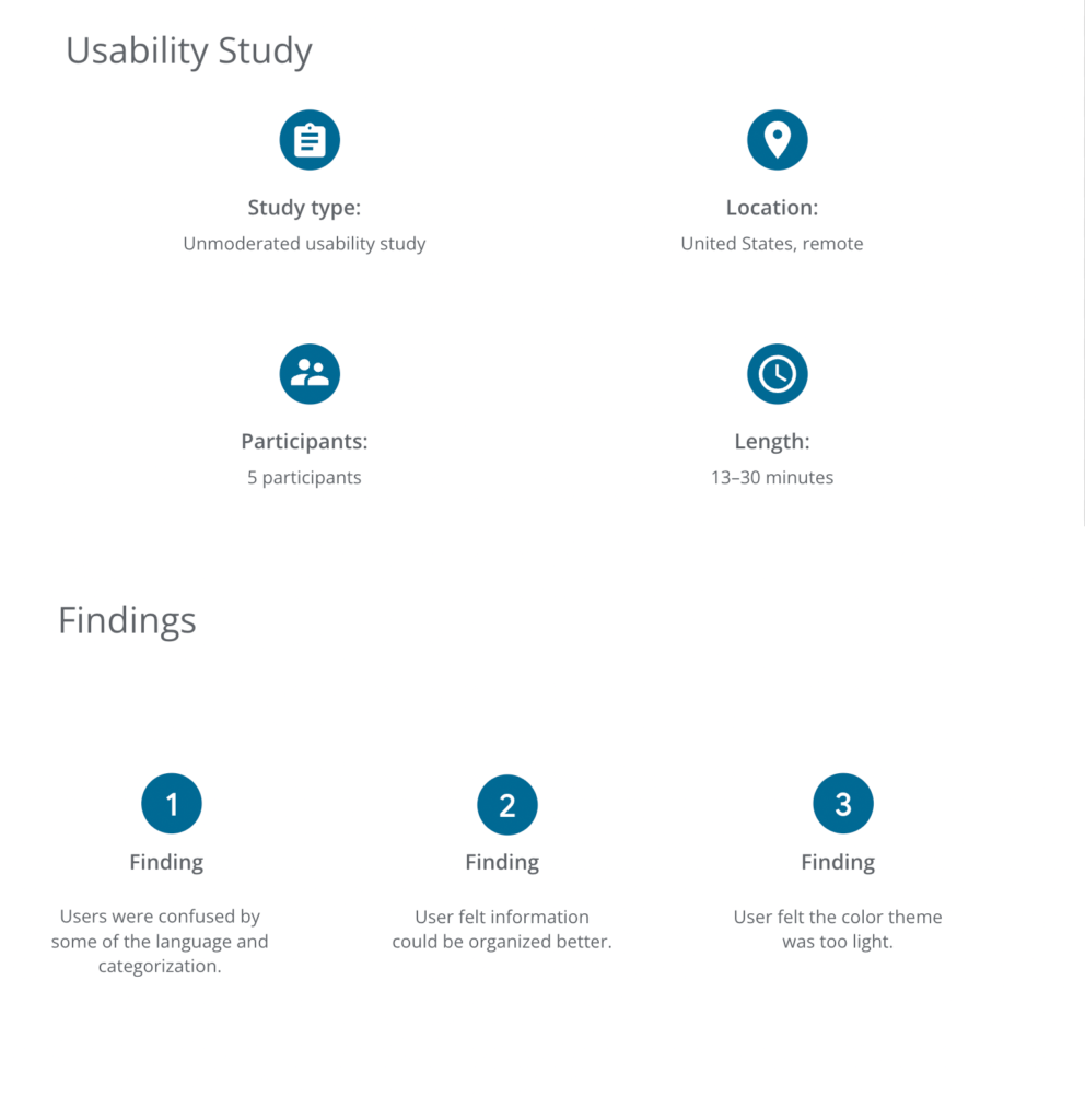
Next I conducted a usability study to gain insight into how easy it was for users to implement the product, where users got snagged, and to determine the elements of the product that were difficult to use or understand.
Some research questions were:
–What can we learn from the user flow and or the steps that users take to procure information provided on the app? –Where does the user get stuck? –How long does it take for the user to make it through the user flow? –Where does the user spend the most time? –Based on the user flow, how might the app be improved?
Using KPIs such as Time on Task, Navigation verses Search, and Conversation Rates, I analyzed what changes needed to be made.
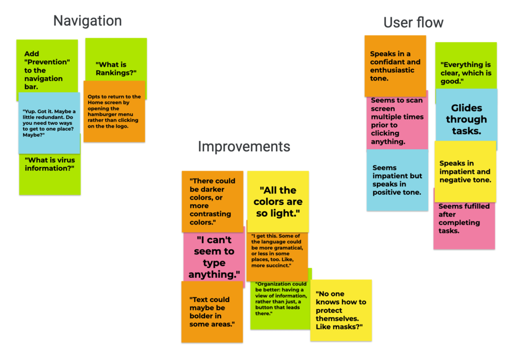
After gathering data, I synthesized it, in part by creating an affinity diagram.
Refining the Design
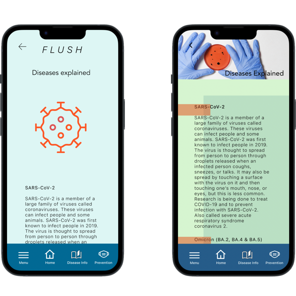
After a second usability study, it was clear that more dynamic colors and images needed to be used for the product to provide for a more engaging experience.
After a second usability study, it was clear that more dynamic colors and images needed to be used for the product to provide for a more engaging experience.
Mockups
High-fidelity Prototypes
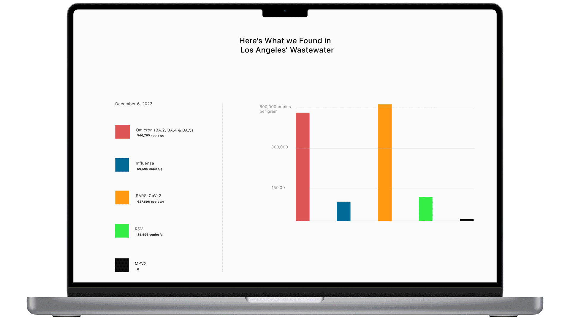
With a wide-ranging user group, including an older demographic, not all users will implement Flush’s phone app—some will access its website via phone, tablet, and laptop/desktop. These high-fidelity prototypes of Flush’s complementary, responsive website showcase the overall design’s consistency and continuity, which make the user experience as a whole better.
With a wide-ranging user group, including an older demographic, not all users will implement Flush’s phone app—some will access its website via tablet and desktop. The below high-fidelity prototypes of Flush’s complementary, responsive website showcase the overall design’s consistency and continuity, which make the user experience as a whole, better.
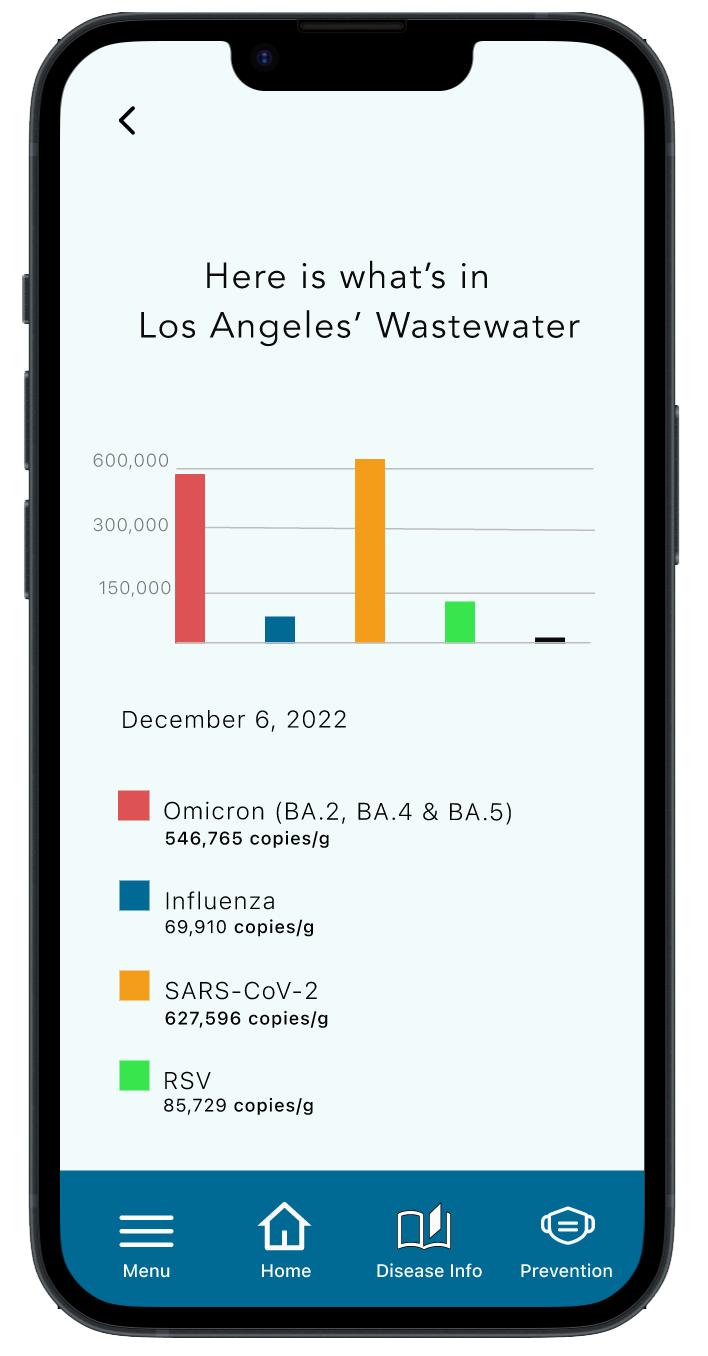
Many accessibility considerations were taken when designing the Flush app and responsive website. Such considerations are evinced in large font, and accessible, deep-blue-colored buttons and navigation, icons grouped with text in the navigation bar, and, bright, high-contrasting colors for graphs and color keys.
Many accessibility considerations were taken when designing the Flush app and responsive website. Such considerations are evinced in large font, and deep-blue-colored buttons and navigation bar, icons grouped with text in the navigation bar, and, bright, high-contrasting colors for bars and lines on charts and graphs.
Responsive Design
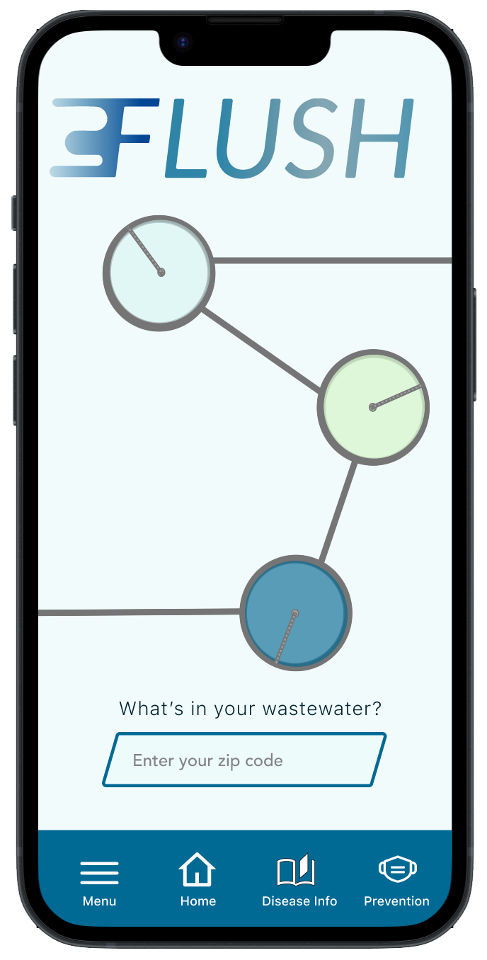
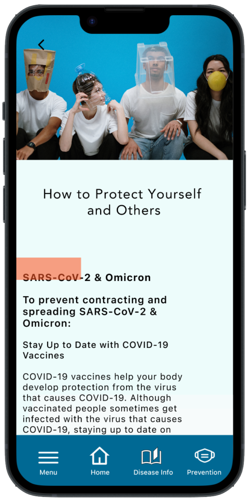
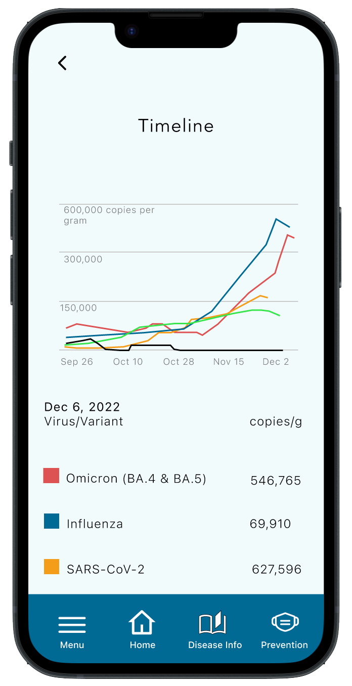
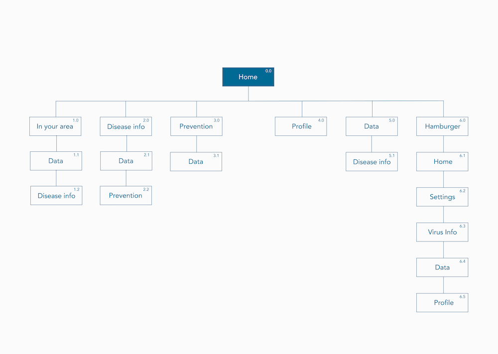
Even prior to conducting a competitive audit, I knew Flush would be an informative but minimalist and streamlined product. Such shows in the fairly sequential site map. The essential data can easily and nearly instantly be accessed from the Homepage. The user can then continue to learn more about diseases detected in their area, as well as ways to protect themselves from those diseases, and can opt to see a graph of how levels of those diseases have differed over time in the area.
Responsive Design
Even prior to conducting a competitive audit, I knew Flush would be an informative but minimalist and streamlined product. Such shows in the fairly sequential site map. The essential data can easily be accessed from the Homepage. The user can then continue to learn more about diseases detected in their area, as well as ways to protect themselves from those diseases, and can opt to see a graph of how levels of those diseases have differed over time in the area.
Takeaways
With a natural curiosity for all that is going on around me (and in the world), I was passionate about working on Flush from the initial stages to the final prototype. I learned that providing data that users will procure daily—like the weather forecasts and air quality readings—needs to be accessible to them stat. And that additional information should be available to them should they want it to answer further questions—but such shouldn’t disrupt the user flow. I was happy to hear from users that they found Flush intuitive, clear, comprehensible, helpful, and healthful.
With a natural curiosity for all that is going on around me (and in the world), I was passionate about working on Flush from the initial stages to the final prototype. I learned that providing data that users will procure daily—like the weather forecasts and air quality readings—needs to be accessible to them stat. And that additional information should be available to them should they want it to answer further questions—but such shouldn’t disrupt the user flow. I was happy to hear from users that they found Flush intuitive, clear, comprehensible, helpful, and healthful.
Let’s Connect.
If you’re looking for a UX designer who’s passionate about their designs, please reach out!